
People spend about 3.3 hours a day surfing the Internet to search for products/services using their mobile devices. Due to this significant shift in consumer behaviour, having a static website that only works on desktop computers makes it insignificant for smartphone users. Also, tablets and smartphone models with distinctive screen dimensions require different designs.
Putting your content into a single column is not going to work on mobile devices.
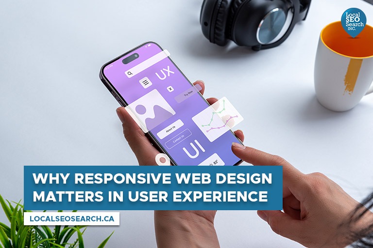
This is where responsive web design comes in. As a mobile device user, you may have heard about it. But what is responsive web design? Here, we will look into responsive web design and its significance in user experience.
What is Responsive Web Design

Responsive design is a modern approach to web design that enables the interface to automatically adapt to the layout of the website and its pages on different devices and screen sizes, whether it is a smartphone, tablet, laptop, desktop, or even a smart TV. This ensures that content looks the same on different devices and, the design elements are sized in a way that relates to each other.
If you think it is time to update your old web design, here are the many significant benefits of responsive web design:
- Connect a larger audience, especially potential customers using mobile devices.
- Reduce time and effort by allowing designers and developers to concentrate on a single design version.
- Boost search engine optimization (SEO), since mobile-friendly websites rank higher in the search engine results pages (SERPs).
- Ensures the consistency of your brand and design on various devices.
Why Responsive Web Design Matters in User Experience
User experience plays a critical factor in user engagement and conversion on a website. It provides a consistent and user-friendly experience on various devices, getting rid of frustrations that you may encounter. A seamless experience leaves you satisfied and increases the chances you will engage with the content.
- Easier Navigation on Any Device
Responsive layouts make it simple to move around a website on various devices. Before, making a site for each device meant designing unique layouts, causing a not-so-smooth experience. Responsive web design solves this by automatically adjusting to the screen size and layout. This makes the site easy to use on any device.
- More Accessible for Everyone
Responsive design also boosts accessibility. People using screen readers or other tools will not face issues with a responsive website. It helps people with slower internet or older devices too, as the site adjusts to their needs.
- Satisfied Users, More Loyalty
A responsive site shows clear and useful info based on the screen size. Satisfied users tend to come back and share their good experiences. Even search engines, like Google appreciate responsive design, bringing in more visitors and business.
- Improves Loading Speed
When surfing the Internet, nobody wants a slow-loading website. Users tend to abandon websites that take more than 2 to 3 seconds to load. Responsive design helps make sure the website loads fast, no matter what device is being used. It involves making images smaller, minimizing CSS and JavaScript files, and using caching methods. Smaller files and optimized code help deliver the website to users’ devices faster, leading to quicker loading times. This not only makes users happy but also boosts search engine rankings. Google and other search engines favour fast-loading sites, so a speedy website tends to rank higher in search results.
SEO Benefits of Responsive Web Design

In addition to user experience, responsive web design also provides various benefits for SEO. SEO involves optimizing a website to rank better in search engine results. Responsive design aligns with Google’s recommendation for mobile-friendly sites, potentially boosting the search rankings for local businesses. Google emphasizes mobile-friendliness and uses mobile-first indexing, prioritizing mobile versions in indexing and ranking.
A responsive website removes the need for separate mobile and desktop versions, preventing issues with duplicate content. Having a single website that adapts to different devices eliminates the risk of duplicate content, which can harm search rankings. Additionally, responsive design enhances website usability and user experience, factors considered by search engines in ranking. Positive user experiences lead to longer time spent on the site, more page visits, and increased content engagement. These positive signals contribute to higher search engine rankings.